R语言学习笔记之相关性矩阵分析及其可视化
 计算相关矩阵
R内置函数cor()可以用来计算相关系数:cor(x, method = c("pearson", "kendall", "spearman")),如果数据有缺失值,用cor(x, method = "pearson", use = "complete.obs")。
导入数据
-
如果数据格式是txt,用
my_data <- read.delim(file.choose()) -
csv则用
my_data <- read.csv(file.choose())导入。 这里我们利用R内置数据集mtcars。
data(mtcars)#加载数据集
mydata <- mtcars[, c(1,3,4,5,6,7)]
head(mydata, 6)#查看数据前6行

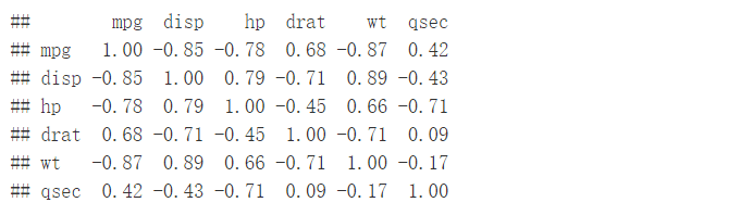
计算相关系数矩阵
res <- cor(mydata)
round(res, 2)#保留两位小数
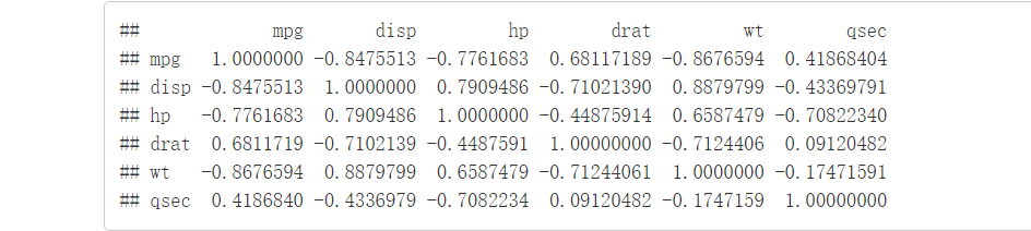
cor()只能计算出相关系数,无法给出显著性水平p-value,Hmisc
包里的rcorr()函数能够同时给出相关系数以及显著性水平p-value。rcorr(x, type = c(“pearson”,“spearman”))。
The output of the function rcorr() is a list containing the following elements : - r : the correlation matrix - n : the matrix of the number of observations used in analyzing each pair of variables - P : the p-values corresponding to the significance levels of correlations.
library(Hmisc)#加载包
res2 <- rcorr(as.matrix(mydata))
res2

#可以用res2$r、res2$P来提取相关系数以及显著性p-value
res2$r
res2$P

如何将相关系数以及显著性水平p-value整合进一个矩阵内,可以自定义一个函数
flattenCorrMatrix。
# ++++++++++++++++++++++++++++
# flattenCorrMatrix
# ++++++++++++++++++++++++++++
# cormat : matrix of the correlation coefficients
# pmat : matrix of the correlation p-values
flattenCorrMatrix <- function(cormat, pmat) {
ut <- upper.tri(cormat) data.frame( row = rownames(cormat)[row(cormat)[ut]],
column = rownames(cormat)[col(cormat)[ut]], cor =(cormat)[ut], p = pmat[ut] )
}
举个栗子
---
res3 <- rcorr(as.matrix(mtcars[,1:7]))
flattenCorrMatrix(res3$r, res3$P)

可视化相关系数矩阵
有不同的方法来可视化,主要有下面四种:
- symnum() function
- corrplot() function to plot a correlogram
- scatter plots
- heatmap
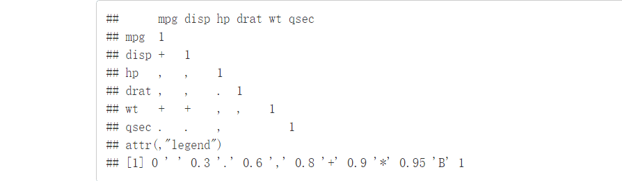
symnum() function
主要用法:
symnum(x, cutpoints = c(0.3, 0.6, 0.8, 0.9, 0.95), symbols = c(" “,”.“,”,“,”+“,”*“,”B“),
abbr.colnames = TRUE) #很好理解,0-0.3用空格表示, 0.3-0.6用.表示, 以此类推。
举个栗子
symnum(res, abbr.colnames = FALSE)#abbr.colnames用来控制列名
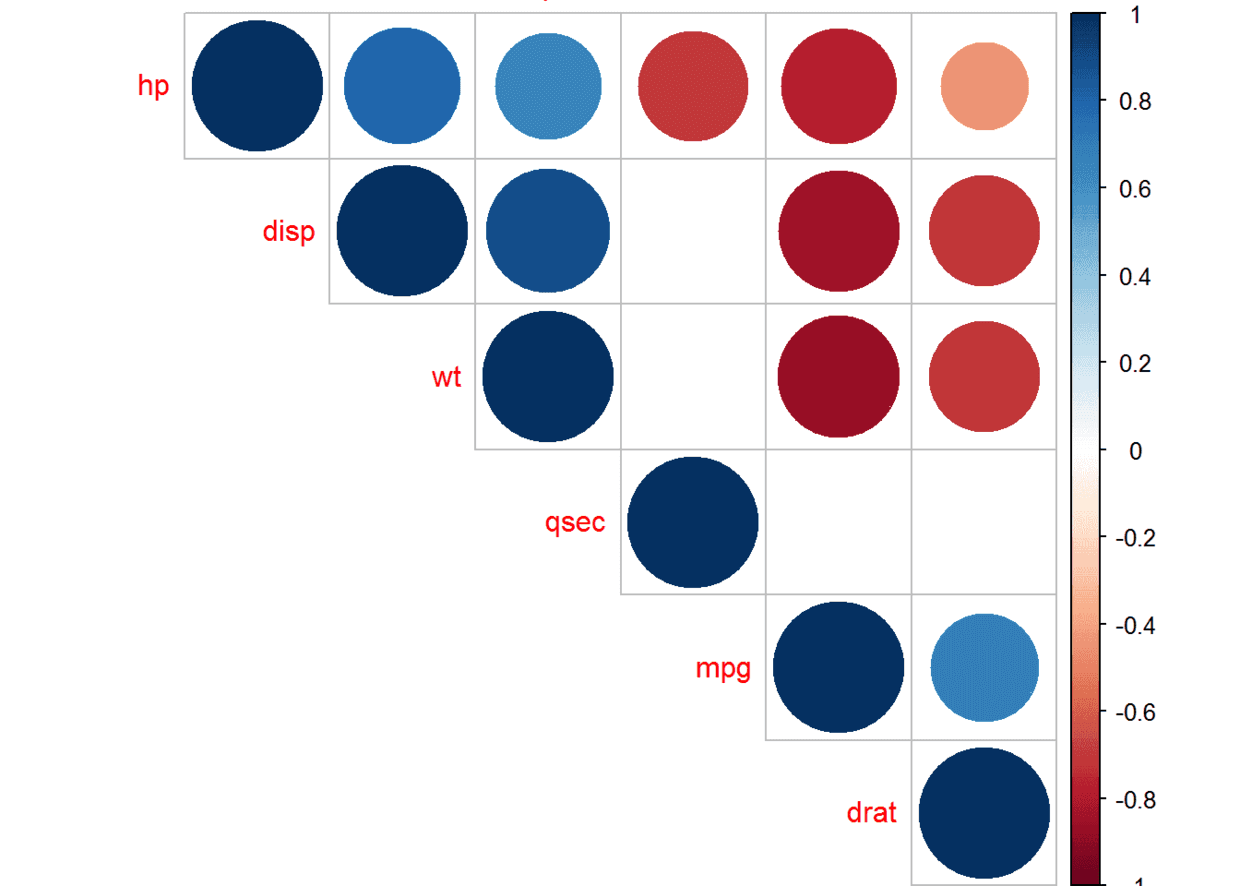
corrplot() function to plot a correlogram
这个函数来自于包corrplot() ,通过颜色深浅来显著相关程度。参数主要有:
- type: “upper”, “lower”, “full”,显示上三角还是下三角还是全部
- order:用什么方法,这里是hclust
- tl.col (for text label color) and tl.srt (for text label string rotation) :控制文本颜色以及旋转角度
library(corrplot)#先加载包
corrplot(res, type = "upper", order = "hclust", tl.col = "black", tl.srt = 45)
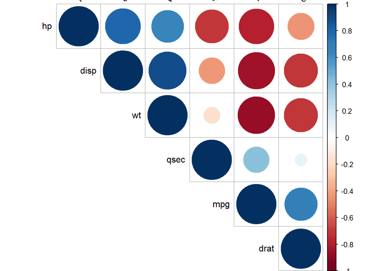
也可以结合显著性绘制
# Insignificant correlations are leaved blank
corrplot(res2$r, type="upper", order="hclust", p.mat = res2$P, sig.level = 0.01, insig = "blank")

Use chart.Correlation(): Draw scatter plots
*chart.Correlation()*来自于包PerformanceAnalytics
library(PerformanceAnalytics)#加载包
chart.Correlation(mydata, histogram=TRUE, pch=19)
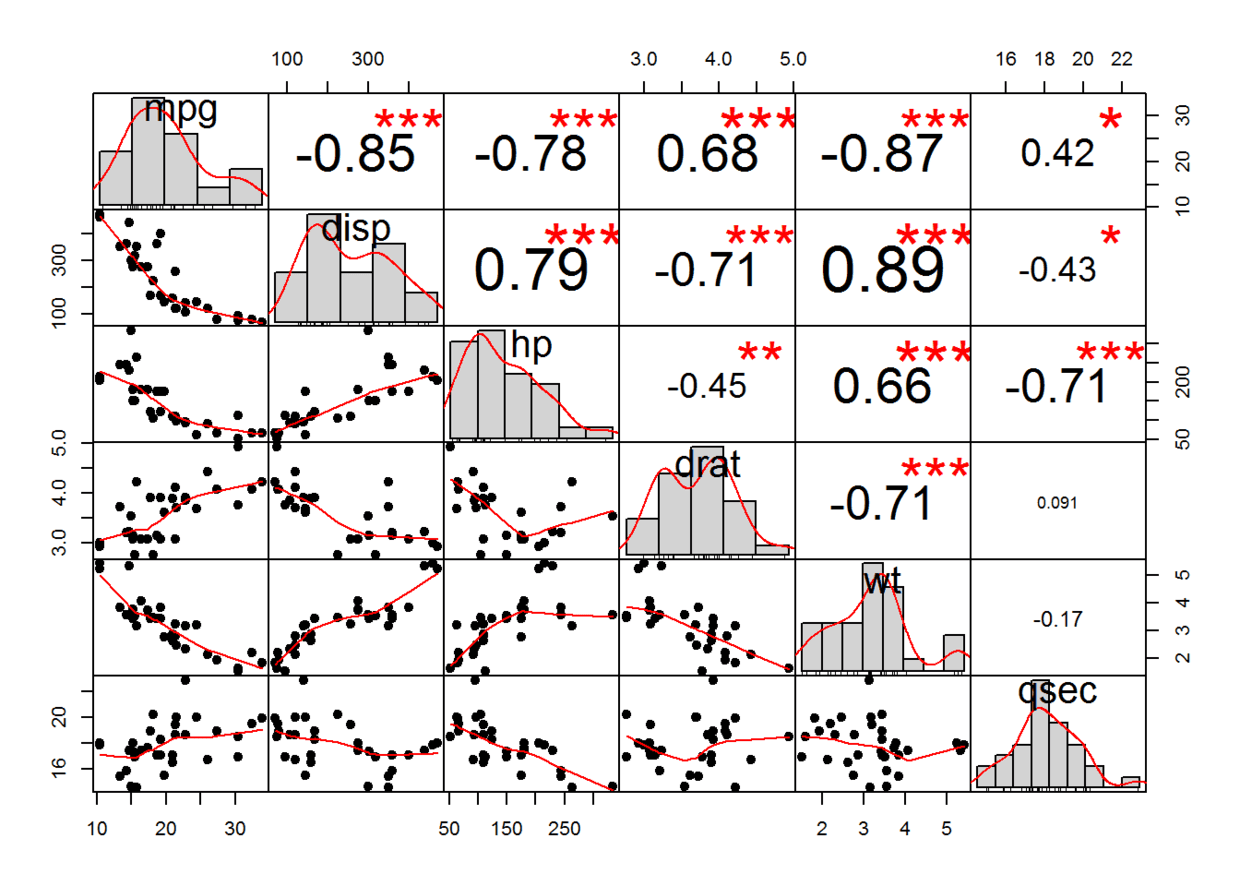 解释一下上图:
- 对角线上显示的是分布图
- 左下部显示的是具有拟合线的双变量散点图
- 右上部显示的是相关系数以及显著性水平
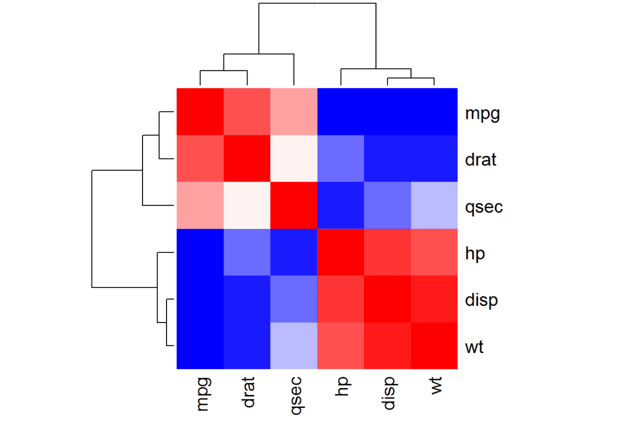
heatmap()
col<- colorRampPalette(c("blue", "white", "red"))(20)#调用颜色版自定义颜色
heatmap(x = res, col = col, symm = TRUE)#symm表示是否对称