ggplot2学习笔记系列之利用ggplot2绘制误差棒及显著性标记
 绘制带有误差棒的条形图
library(ggplot2)
#创建数据集
df <- data.frame(treatment = factor(c(1, 1, 1, 2, 2, 2, 3, 3, 3)),
                 response = c(2, 5, 4, 6, 9, 7, 3, 5, 8),
                 group = factor(c(1, 2, 3, 1, 2, 3, 1, 2, 3)),
                 se = c(0.4, 0.2, 0.4, 0.5, 0.3, 0.2, 0.4, 0.6, 0.7))
head(df) #查看数据集

##   treatment response group  se
## 1    1         2       1    0.4
## 2    1         5       2    0.2
## 3    1         4       3    0.4
## 4    2         6       1    0.5
## 5    2         9       2    0.3
## 6    2         7       3    0.2
# 使用geom_errorbar()绘制带有误差棒的条形图
# 这里一定要注意position要与`geom_bar()`保持一致,由于系统默认dodge是0.9,
# 因此geom_errorbar()里面position需要设置0.9,width设置误差棒的大小
ggplot(data = df, aes(x = treatment, y = response, fill = group)) +
geom_bar(stat = "identity", position = "dodge") +
geom_errorbar(aes(ymax = response + se, ymin = response -  se),
position = position_dodge(0.9), width = 0.15) +
scale_fill_brewer(palette = "Set1")

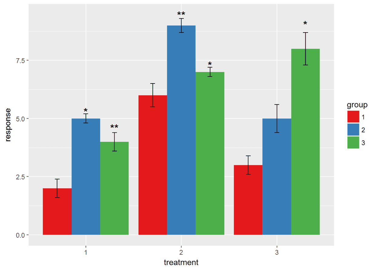
绘制带有显著性标记的条形图
label <- c("", "*", "**", "", "**", "*", "", "", "*") #这里随便设置的显著性,还有abcdef等显著性标记符号,原理一样,这里不再重复。
# 添加显著性标记跟上次讲的添加数据标签是一样的,这里我们假设1是对照
ggplot(data = df, aes(x = treatment, y = response, fill = group)) +
geom_bar(stat = "identity", position = "dodge") +
geom_errorbar(aes(ymax = response + se, ymin = response -  se),
position = position_dodge(0.9), width = 0.15) +
geom_text(aes(y = response +  1.5 * se, label = label, group = group),
position = position_dodge(0.9), size = 5, fontface = "bold") +
scale_fill_brewer(palette = "Set1") #这里的label就是刚才设置的,group是数据集中的,fontface设置字体。
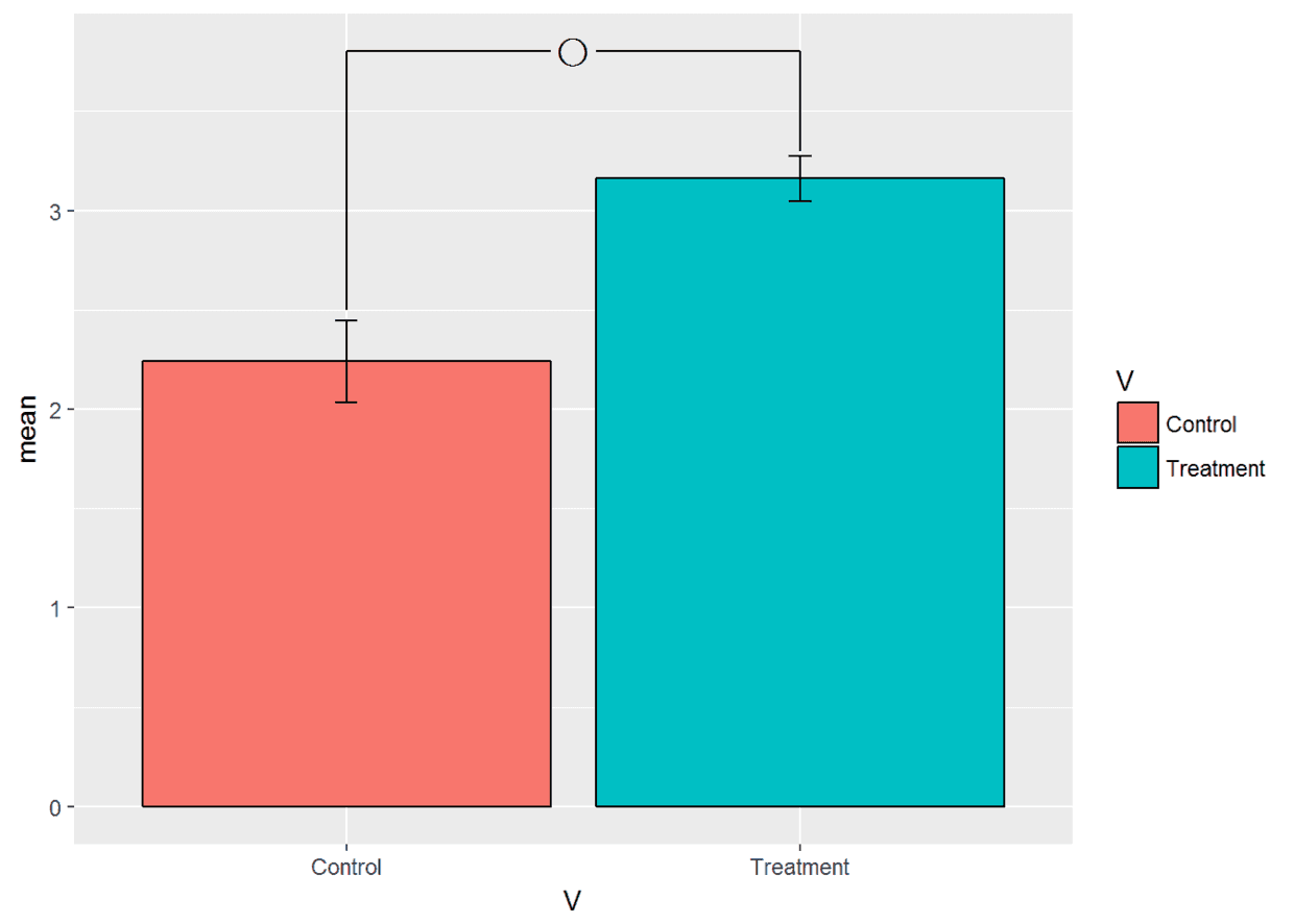
绘制两条形图中间带有星号的统计图
#创建一个简单的数据集
Control <- c(2.0,2.5,2.2,2.4,2.1)
Treatment <- c(3.0,3.3,3.1,3.2,3.2)
mean <- c(mean(Control), mean(Treatment))
sd <- c(sd(Control), sd(Treatment))
df1 <- data.frame(V=c("Control", "Treatment"), mean=mean, sd=sd)
df1$V <- factor(df1$V, levels=c("Control", "Treatment"))
#利用geom_segment()绘制图形
ggplot(data=df1, aes(x=V, y=mean, fill=V))+
geom_bar(stat = "identity",position = position_dodge(0.9),color="black")+
geom_errorbar(aes(ymax=mean+sd, ymin=mean-sd), width=0.05)+
geom_segment(aes(x=1, y=2.5, xend=1, yend=3.8))+#绘制control端的竖线
geom_segment(aes(x=2, y=3.3, xend=2, yend=3.8))+#绘制treatment端竖线
geom_segment(aes(x=1, y=3.8, xend=1.45, yend=3.8))+
geom_segment(aes(x=1.55, y=3.8, xend=2, yend=3.8))+#绘制两段横线
annotate("text", x=1.5, y=3.8, label="〇", size=5)#annotate函数也可以添加标签
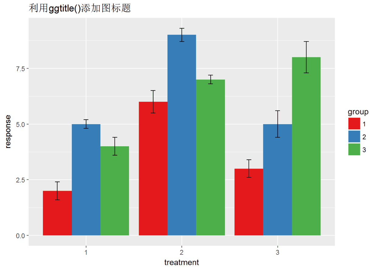
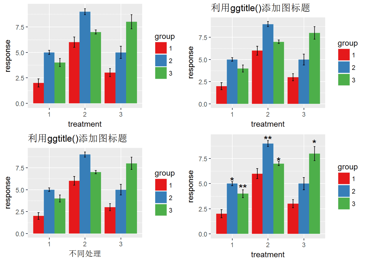
为图形添加标题
图形标题有图标题、坐标轴标题、图例标题等
p <- ggplot(data = df, aes(x = treatment, y = response, fill = group)) +
geom_bar(stat = "identity", position = "dodge") +
geom_errorbar(aes(ymax = response + se, ymin = response -  se),
position = position_dodge(0.9), width = 0.15) +
scale_fill_brewer(palette = "Set1")# 利用ggtitle()添加图标题,还有labs()也可以添加标题,最后会提一下。(有一个问题就是ggtitle()添加的标题总是左对齐)
p + ggtitle("利用ggtitle()添加图标题")
# 利用xlab()\ylab()添加/修改坐标轴标题
p + ggtitle("利用ggtitle()添加图标题") +
xlab("不同处理") +
ylab("response") #标题的参数修改在theme里,theme是一个很大的函数,几乎可以定义一切,下次有时间会讲解
 最后再讲解一下如何将多副图至于一个页面 利用包gridExtra中
grid.arrange()函数实现
# 将四幅图放置于一个页面中
p <- ggplot(data = df, aes(x = treatment, y = response, fill = group)) +
geom_bar(stat = "identity", position = "dodge") +
geom_errorbar(aes(ymax = response + se, ymin = response -  se),
position = position_dodge(0.9), width = 0.15) +
scale_fill_brewer(palette = "Set1")
p1 <- p + ggtitle("利用ggtitle()添加图标题")
p2 <- p + ggtitle("利用ggtitle()添加图标题") + xlab("不同处理") + ylab("response")
p3 <- ggplot(data = df, aes(x = treatment, y = response, fill = group)) +
geom_bar(stat = "identity", position = "dodge") +
geom_errorbar(aes(ymax = response + se, ymin = response -  se),
position = position_dodge(0.9), width = 0.15) +
geom_text(aes(y = response +  1.5 * se, label = label, group = group),
position = position_dodge(0.9), size = 5, fontface = "bold") +
scale_fill_brewer(palette = "Set1")
library(gridExtra) #没有安装此包先用install.packages('gridExtra')安装
grid.arrange(p, p1, p2, p3)
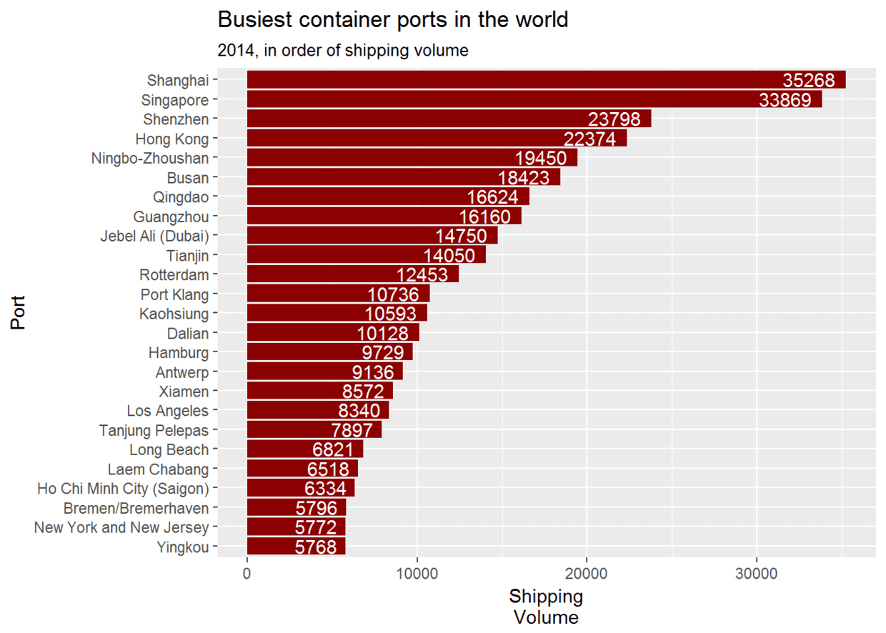
 上次有人问坐标轴旋转的实现,坐标轴旋转有时是很有用的,下面是我看过的一个例子,用来介绍一下。
#先加载他的数据
url.world_ports <- url("https://sharpsightlabs.com/wp-content/datasets/world_ports.RData")
load(url.world_ports)
knitr::kable(df.world_ports[1:5,])#该数据是关于世界上各个港口的数据汇总
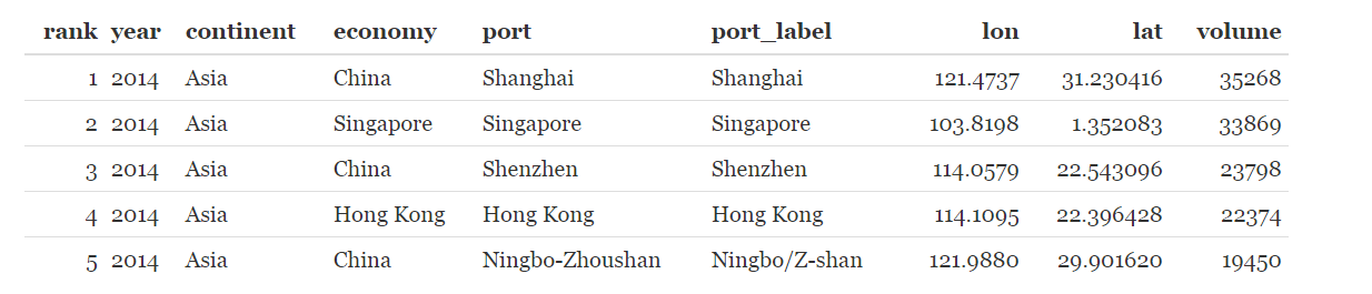
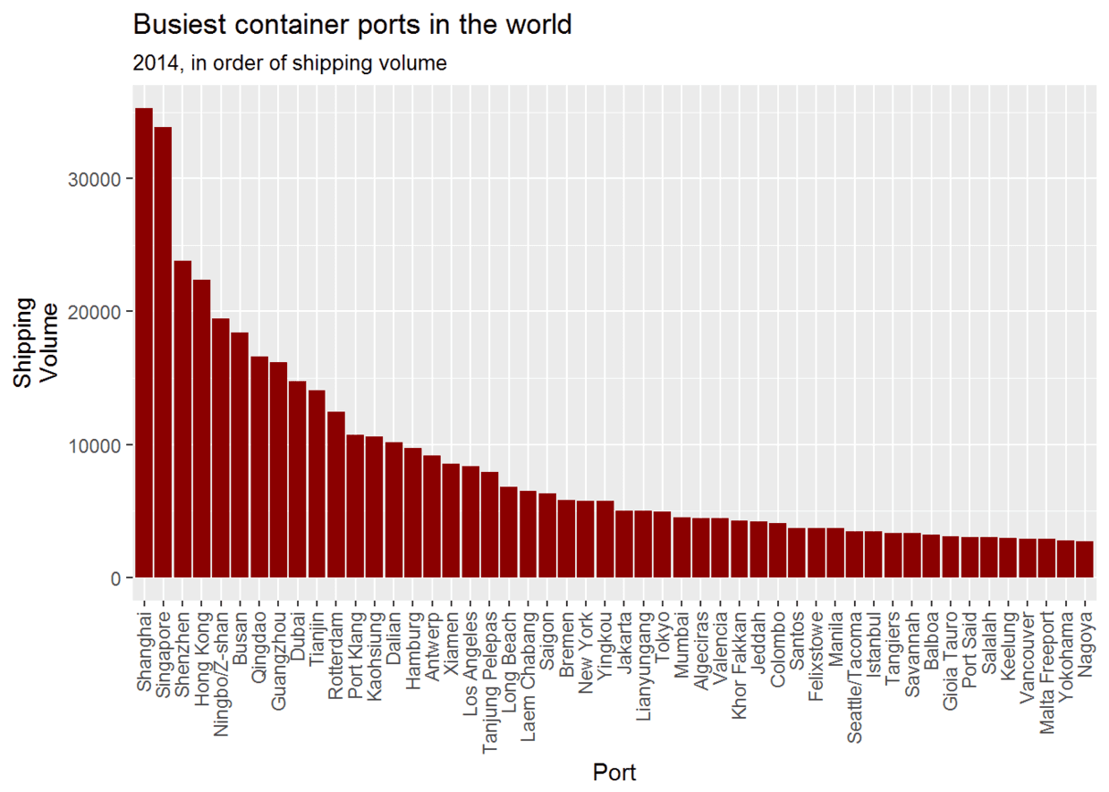
library(dplyr) #用于数据操作,与ggplot2一样是R语言必学包#现在绘制条形图(%>%上次说过是管道操作,用于连接各个代码,十分有用)
df.world_ports%>%filter(year==2014)%>% #筛选2014年的数据
ggplot(aes(x=reorder(port_label, desc(volume)), y=volume))+
geom_bar(stat = "identity", fill="darkred")+
labs(title="Busiest container ports in the world")+
labs(subtitle = '2014, in order of shipping volume')+ #添加副标题
labs(x = "Port", y = "Shipping\nVolume")+
theme(axis.text.x = element_text(angle = 90, hjust = 1, vjust = .4))#调整x轴标签,angle=90表示标签旋转90度,从图中可以看出
#现在旋转坐标轴,并筛选排名小于25的港口,并且添加数据标签
df.world_ports %>% filter(year==2014, rank<=25) %>% #筛选2014年并且rank小于等于25的数据
ggplot(aes(x=reorder(port, volume), y=volume))+
geom_bar(stat = "identity", fill="darkred")+
labs(title="Busiest container ports in the world")+
labs(subtitle = '2014, in order of shipping volume')+
labs(x = "Port", y = "Shipping\nVolume")+
geom_text(aes(label=volume), hjust=1.2, color="white")+
coord_flip()#旋转坐标轴

两图相比,明显第二幅图好,一是可以添加数据标签,二是不用歪着脖子看。 本来打算讲讲图例的但是发现内容太多了,就不讲了,下次吧!