使用override.aes控制ggplot2中的图例外观
本文来自于https://aosmith.rbind.io/2020/07/09/ggplot2-override-aes/,记录翻译学习
ggplot2中的aesthetics以及scale_*()函数会同时修改包括图例在内的整个图形。guide_legend()中的override.aes参数允许用户只修改图例外观,不会对图形的其他部分进行修改。这对于使图例更具可读性或者创建一些类型的组合图例十分有用。
本文先介绍override.aes的一个基本示例,然后再介绍另外三种绘图方案以说明override.aes如何使用。
R包
本文唯一使用的R包只有ggplot2
if (!requireNamespace("BiocManager", quietly = TRUE))
    install.packages("BiocManager")
library(ggplot2)
override.aes
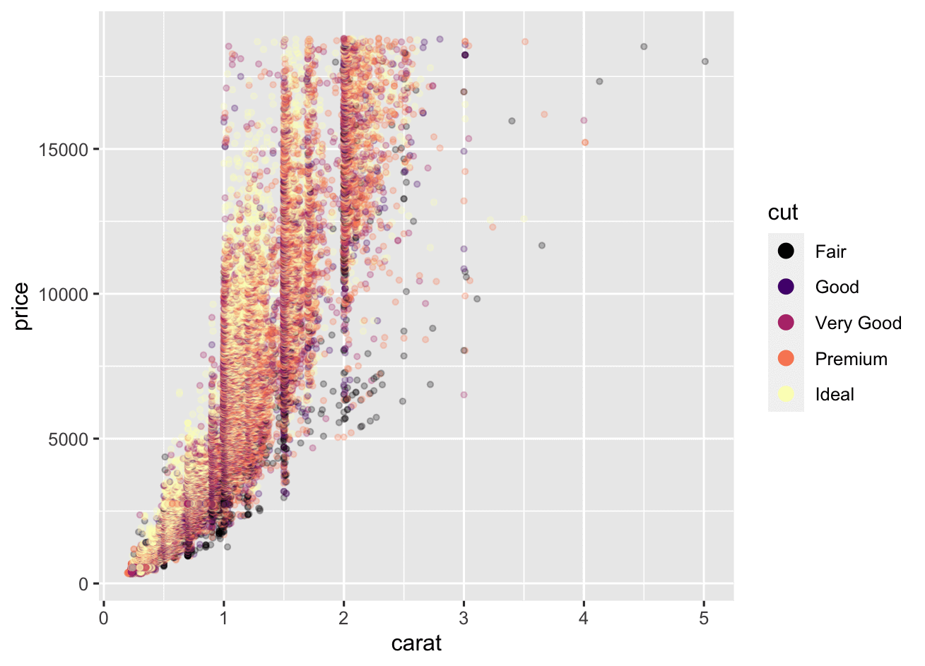
更改图例的同时不修改图的原因是使图例更具有可读性,先使用数据集diamonds开始,我们将cut变量映射为color属性,然后设置alpha增加透明度,size控制点大小
ggplot(data = diamonds, aes(x = carat, y = price, color = cut) ) +
     geom_point(alpha = .25, size = 1)
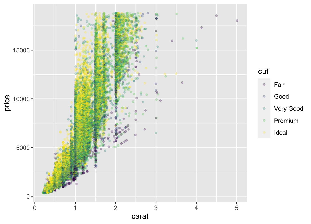
可以看到alpha以及size不仅修改了图中点的属性,同时图例中的点的属性也被修改了。
添加guides()图层
当散点图绘制大量的点时,将点变小变透明是可取的,但是对于图例就不是那么具有可读性了,这种情况下,我们修改额外通过修改图例点的大小以及透明度来使图例更具有可读性。一种方法是添加guides()层,这里是color属性,所以我们可以通过color = guides_legend()来进行修改,override.aes是guide_legend()的其中一个参数,可以一次性提供一系列的美学参数列表,这些参数将覆盖默认(全局)的图例外观。
这里我们先修改图例点大小
ggplot(data = diamonds, aes(x = carat, y = price, color = cut) ) +
     geom_point(alpha = .25, size = 1) +
     guides(color = guide_legend(override.aes = list(size = 3) ) )
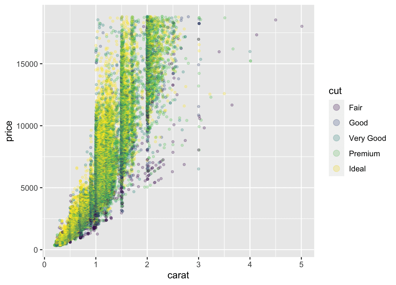
可以看到图中的点属性是没有发生变化的,但是图例中的点大小变化了
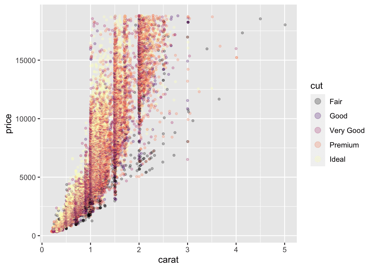
在scale_*()中使用guide参数
如果想通过scale_color_*()函数来修改颜色,我们可以直接在函数里面使用guide参数来代替单独添加的guides()图层。这里假设使用scale_colr_viridis_d()来更改整个图的默认颜色,我们可以直接直接通过guide参数来修改图例属性:
ggplot(data = diamonds, aes(x = carat, y = price, color = cut) ) +
     geom_point(alpha = .25, size = 1) +
     scale_color_viridis_d(option = "magma",
                           guide = guide_legend(override.aes = list(size = 3) ) )
修改多个美学参数
直接将多个参数添加到list中就行了:
ggplot(data = diamonds, aes(x = carat, y = price, color = cut) ) +
     geom_point(alpha = .25, size = 1) +
     scale_color_viridis_d(option = "magma",
                           guide = guide_legend(override.aes = list(size = 3,
                                                                    alpha = 1) ) )
修改图例中的部分美学属性
仅删除图例中的部分美学属性是override.aes的另一种用法,比如当基于不同数据集但是基于相同id的变量映射进行图层添加的时候,这种用法就非常有用了。
下面这个例子基于 this Stack Overflow question。
points = structure(list(x = c(5L, 10L, 7L, 9L, 86L, 46L, 22L, 94L, 21L,
6L, 24L, 3L), y = c(51L, 54L, 50L, 60L, 97L, 74L, 59L, 68L, 45L,
56L, 25L, 70L), id = c("a", "a", "a", "a", "b", "b", "b", "b",
"c", "c", "c", "c")), row.names = c(NA, -12L), class = "data.frame")

head(points)
#    x  y id
# 1  5 51  a
# 2 10 54  a
# 3  7 50  a
# 4  9 60  a
# 5 86 97  b
# 6 46 74  b
box = data.frame(left = 1, right = 10, bottom = 50, top = 60, id = "a")
box
#   left right bottom top id
# 1    1    10     50  60  a
基于这两个数据集进行图层叠加:将id变量映射给color
ggplot(data = points, aes(color = id) ) +
     geom_point(aes(x = x, y = y), size = 4) +
     geom_rect(data = box, aes(xmin = left,
                               xmax = right,
                               ymin = 50,
                               ymax = top),
               fill = NA, size = 1)
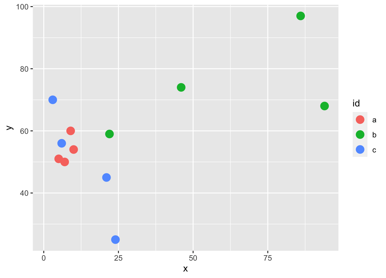
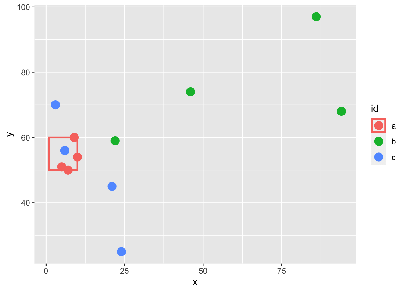
可以看到,矩阵框颜色映射到了所以点上,导致图例中所有点都有一个外轮廓,这里我们想的是去除b,c两个点的轮廓映射,只保留点a的。图例中点的轮廓是基于linetype美学的,所以我们可以利用override.aes 来去除这些线条框,将之设置为0即可:
ggplot(data = points, aes(color = id) ) +
     geom_point(aes(x = x, y = y), size = 4) +
     geom_rect(data = box, aes(xmin = left,
                               xmax = right,
                               ymin = 50,
                               ymax = top),
               fill = NA, size = 1) +
     guides(color = guide_legend(override.aes = list(linetype = c(1, 0, 0) ) ) )
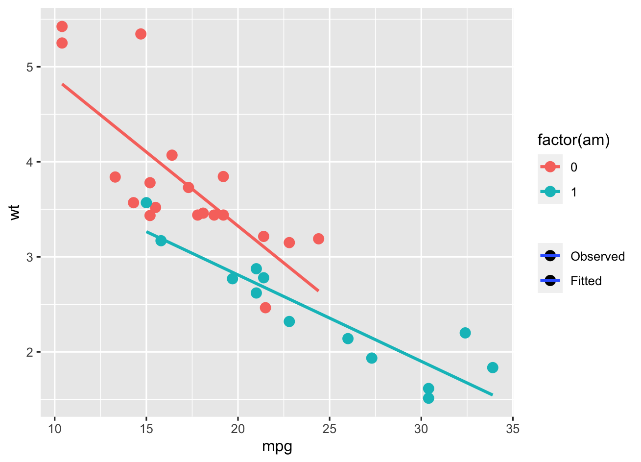
组合多图层图例
ggplot(data = mtcars, aes(x = mpg, y = wt, color = factor(am) ) ) +
     geom_point(size = 3) +
     geom_smooth(method = "lm", se = FALSE)
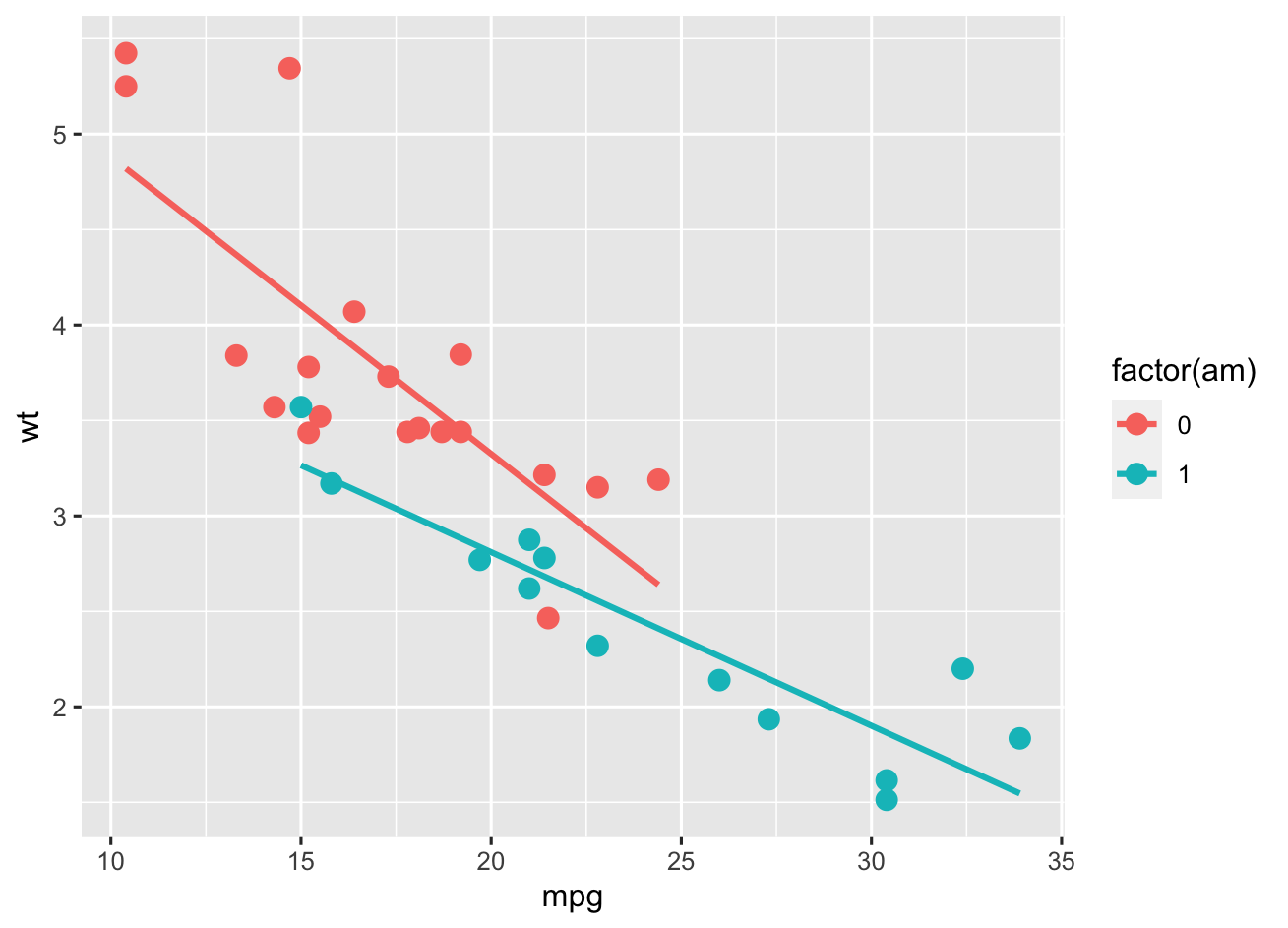
上面实际上是两个图层,一个是散点图层,另一个是直线图层,但是图例是结合在一起的展示的,现在我们想只留下color图例,然后添加一个额外的线图层:一个图例表示点是观察值,线是拟合线,使用alpha美学来实现,这里实际上我们是没有用到alpha美学,但是却可以影响所有图层,这是一个添加额外图例的小技巧,这里我不想更改图形外观,所以添加scale_alpha_manual()设置values=c(1,1)来保证所有图层都是不透明的,同时还移除了图例名称(name=NULL):
ggplot(data = mtcars, aes(x = mpg, y = wt, color = factor(am) ) ) +
     geom_point(aes(alpha = "Observed"), size = 3) +
     geom_smooth(method = "lm", se = FALSE, aes(alpha = "Fitted") ) +
     scale_alpha_manual(name = NULL,
                        values = c(1, 1),
                        breaks = c("Observed", "Fitted") )
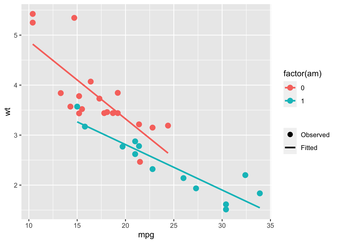
又有新的问题,两个图例都同时含有点以及线,我们需要移除第二个图例的点,这就需要用到我们上面讲的技巧了:
ggplot(data = mtcars, aes(x = mpg, y = wt, color = factor(am) ) ) +
     geom_point(aes(alpha = "Observed"), size = 3) +
     geom_smooth(method = "lm", se = FALSE, aes(alpha = "Fitted") ) +
     scale_alpha_manual(name = NULL,
                        values = c(1, 1),
                        breaks = c("Observed", "Fitted"),
                        guide = guide_legend(override.aes = list(linetype = c(0, 1),
                                                                  shape = c(16, NA),
                                                                  color = "black") ) )
控制多图例外观
先构造两个数据集:
dat = structure(list(g1 = structure(c(1L, 2L, 1L, 2L, 1L, 2L, 1L, 2L,
1L, 2L, 1L, 2L, 1L, 2L, 1L, 2L), class = "factor", .Label = c("High",
"Low")), g2 = structure(c(1L, 1L, 2L, 2L, 1L, 1L, 2L, 2L, 1L,
1L, 2L, 2L, 1L, 1L, 2L, 2L), class = "factor", .Label = c("Control",
"Treatment")), x = c(0.42, 0.39, 0.56, 0.59, 0.17, 0.95, 0.85,
0.25, 0.31, 0.75, 0.58, 0.9, 0.6, 0.86, 0.61, 0.61), y = c(-1.4,
3.6, 1.1, -0.1, 0.5, 0, -1.8, 0.8, -1.1, -0.6, 0.2, 0.3, 1.1,
1.6, 0.9, -0.6)), class = "data.frame", row.names = c(NA, -16L
))

head(dat)
#     g1        g2    x    y
# 1 High   Control 0.42 -1.4
# 2  Low   Control 0.39  3.6
# 3 High Treatment 0.56  1.1
# 4  Low Treatment 0.59 -0.1
# 5 High   Control 0.17  0.5
# 6  Low   Control 0.95  0.0
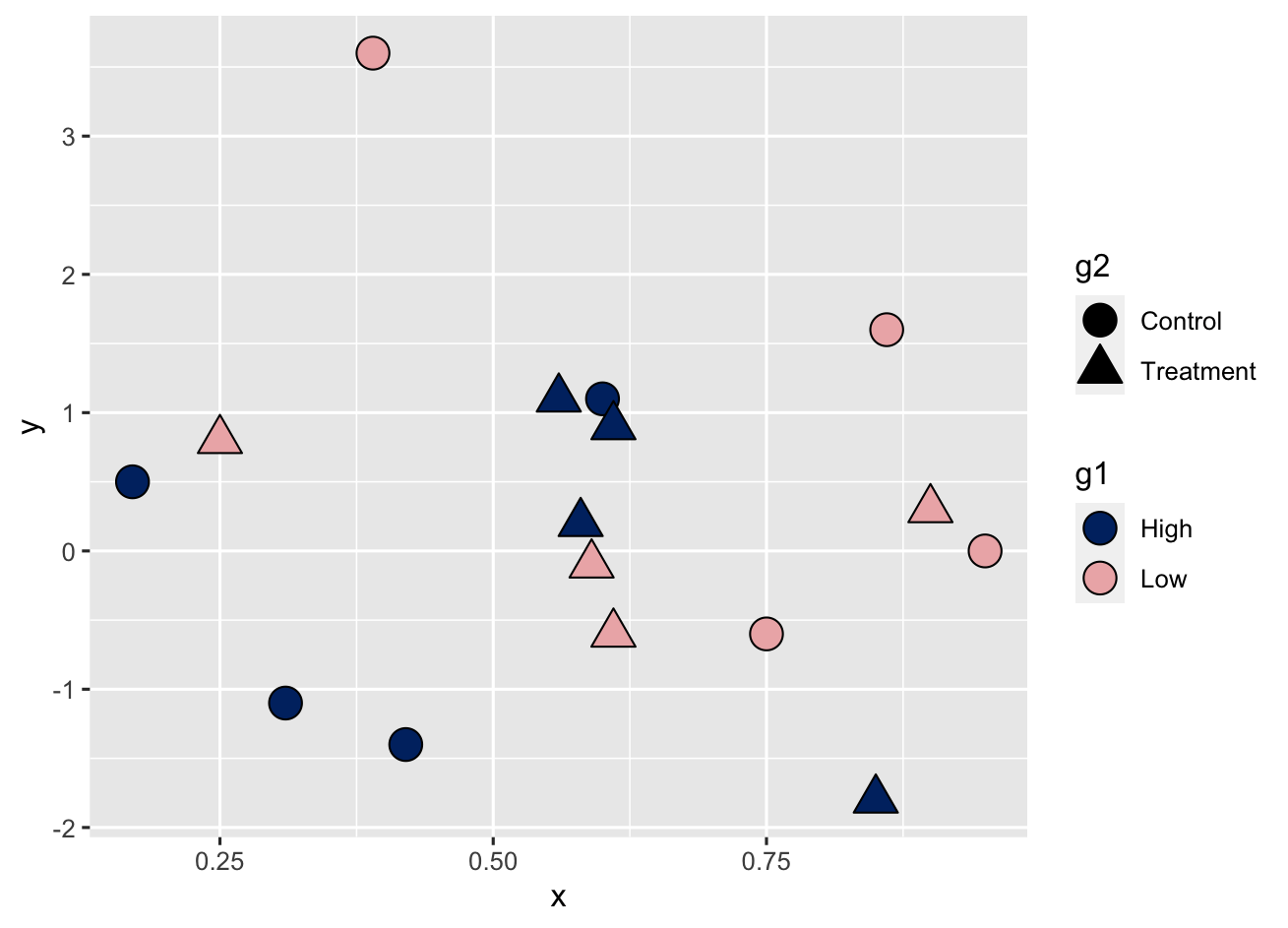
ggplot(data = dat, aes(x = x, y = y, fill = g1, shape = g2) ) +
     geom_point(size = 5) +
     scale_fill_manual(values = c("#002F70", "#EDB4B5") ) +
     scale_shape_manual(values = c(21, 24) )
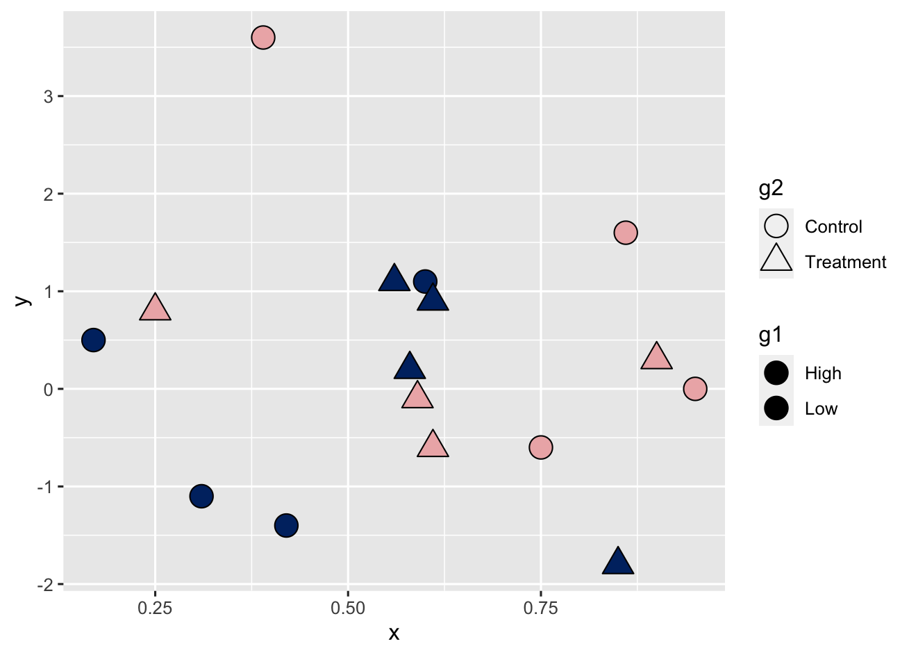
ggplot(data = dat, aes(x = x, y = y, fill = g1, shape = g2) ) +
     geom_point(size = 5) +
     scale_fill_manual(values = c("#002F70", "#EDB4B5") ) +
     scale_shape_manual(values = c(21, 24) ) +
     guides(fill = guide_legend(override.aes = list(shape = 21) ),
            shape = guide_legend(override.aes = list(fill = "black") ) )
这个看起来有点难以理解,实际上就是我们设置的这类形状具有两个属性:fill以及shape,所以g1映射给fill,g2映射给shape,通过overrid.aes我们赋予了g2图例填充颜色黑色,然后赋予g1形状为21。